Journeys in Page Analysis
Last updated: March 20, 2026
The Journeys tab in Page Analysis shows how users navigate to and from a specific page on your ecommerce site. By mapping inbound and outbound traffic flows, it helps product and UX teams understand the most common user paths, where customers drop off, and how they progress across your site. This can provide valuable insights for optimizing navigation, reducing abandonment, and increasing conversions.
Journeys Overview
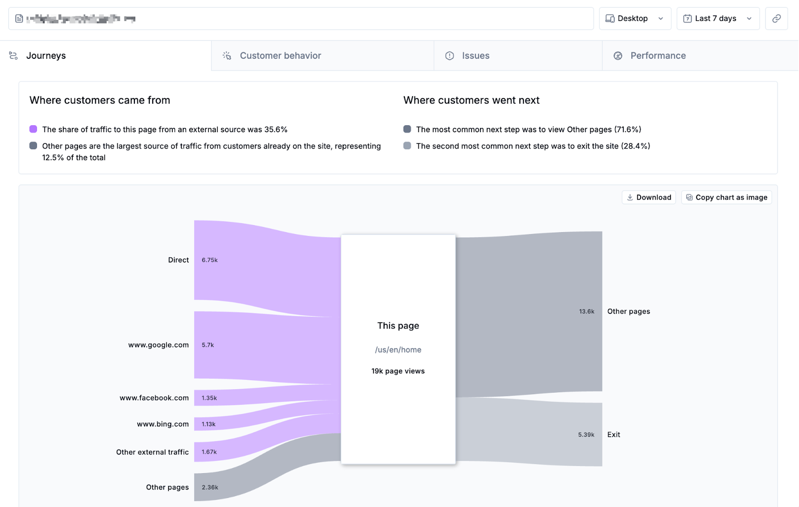
After choosing a URL or Page Group for analysis, click the Journeys tab. At the top of this page, you’ll find a summary of key traffic insights:
Where customers came from: Highlights the largest external traffic source (e.g., Google, Facebook) and the most common previous page or page group from within the site.
Where customers go next: Shows the top two next destinations, whether individual pages or page groups.
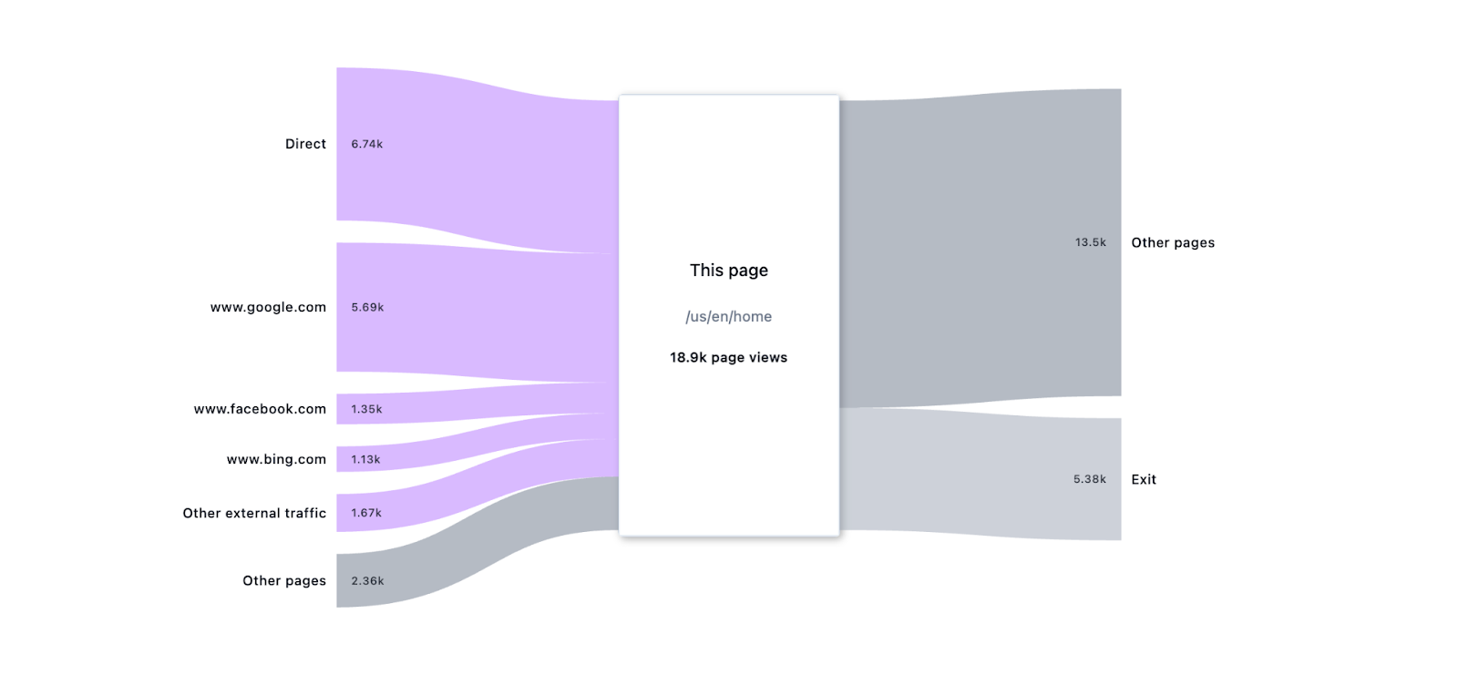
Below the summary is a Sankey chart that provides a detailed visualization of user journeys. This chart is comprised of three main sections:
Inbound traffic: Represents how users arrived at the selected page, including direct traffic, external sources, and navigation from other pages.
This page: Shows the URL of the current page with the total count of pageviews for the chosen time range and device type (e.g., Desktop, last 7 days).
Outbound traffic: Indicates where users went next after visiting the page. Each branch is labeled with traffic counts.
Each branch of the Sankey chart is colour-coded as follows. Note that the Journeys feature works best when page groups are configured for your domain. This allows data to be grouped by common ecommerce page types, like cart, checkout, and collection. Learn more about configuring page groups.
 | External traffic |
 | Exit traffic |
 | Pages categorized as Home page group |
 | Pages categorized as Collection (PLP) page group |
 | Pages categorized as Search page group |
 | Pages categorized as Product (PDP) page group |
 | Pages categorized as Cart page group |
 | Pages categorized as Checkout page group
|
 | Pages categorized as Login page group |
 | Uncategorized pages and custom page groups including navigation within the site |
Note: If a URL is included in multiple page groups, it will be double-counted in inbound and outbound branches.
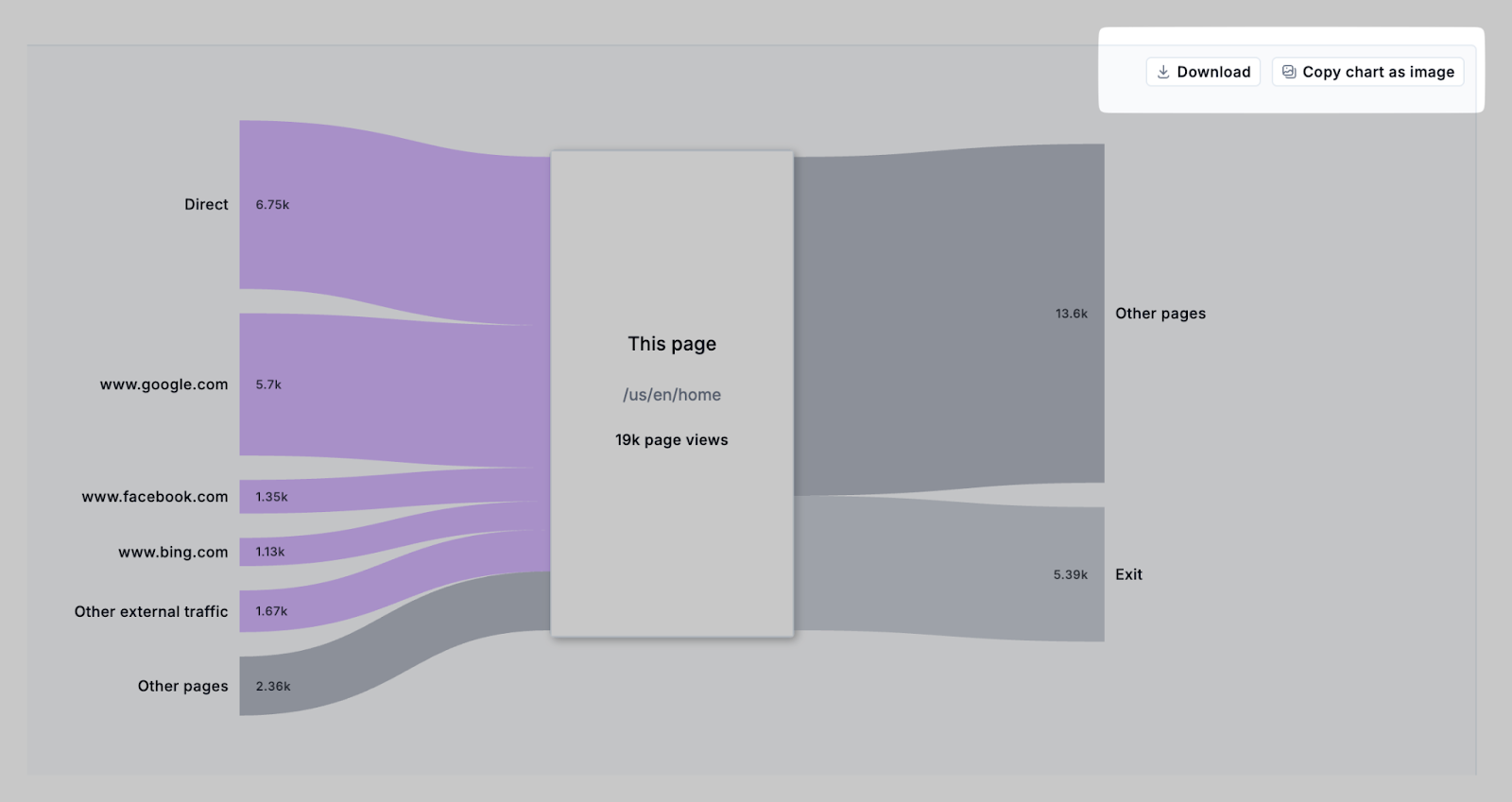
Clicking the Download or Copy chart as image buttons allows you to save the chart for reporting or presentations.
Clicking on a branch expands a breakdown of visits up to the top 1000 pages within that overarching group. Click the Download button to save a CSV that can be used for external analysis.
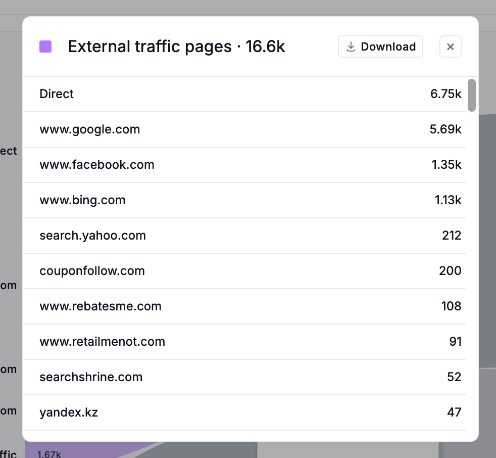
Additionally, for inbound and outbound traffic groups, you can click the … beside the traffic count to copy the URL of a specific page within the group, or to view the Journeys tab for the selected page.

Analyzing user journeys
The Journeys tab helps teams visualize how customers move through the storefront, revealing common navigation paths, drop-offs, and unexpected behaviours. It also supports deeper analysis by linking journey data with click maps, scroll maps, performance metrics, and issue tracking.
Types of questions that can be explored with Journeys include:
What are the most common traffic sources driving visitors to a specific page on my website? This can help validate if users from high-traffic landing pages are taking expected next steps.
What were the most common pages visitors came from to land on any given page? This can help measure how specific campaigns are performing.
What were the most common pages visitors went to next from any given page? Looking at Exit paths can help uncover drop-off in critical funnel stages.
Are there differences in visitor flows by time period or device type (Desktop vs. Mobile)? This can uncover differences in user segments or time periods to investigate further.
As you explore these types of insights with Journeys, sharing the Sankey chart visualizations helps align product, UX, marketing, and engineering teams on key insights. Exporting data allows for deeper analysis alongside conversion rates, campaign data, and other business reporting.