Heat Maps in Page Analysis
Last updated: April 22, 2026
The Heat maps tab in Page Analysis helps ecommerce teams understand how shoppers interact with pages by reconstructing real user sessions as a visual overlay. Click maps show where users click, scroll maps show how deep they navigate, and conversion metrics reveal which elements and pages contribute to checkout — so teams can prioritize changes based on revenue impact, not just engagement volume.

Click maps
After choosing a page for analysis, the Click Maps view displays an interactive reconstruction of the page, overlaid with a colour gradient that visualizes the frequency of user clicks. Click maps are useful for evaluating the effectiveness of calls to action, image placements, and page elements, and for validating whether interaction patterns change following content updates.
By default, the click map displays click rate — a measure of how many page viewers interacted with each element. At the top of the click map, an indicator shows the total number of clicks logged by Noibu for the selected time period and device type. You can switch between three views using the toggle above the heat map:
Click rate: Shows engagement as measured by which elements attract the most interactions relative to page traffic.
Checkout conversion rate: Shows which elements are associated with completed checkouts, regardless of overall click volume.
Revenue per session: Highlights the elements associated with higher-value purchases.
Important: Revenue per session requires order data to be available in Noibu. It is automatically enabled for Shopify, BigCommerce, and Magento (Adobe Commerce Storefront Events SDK) customers.
For stores on other platforms, order data can be sent to Noibu using the
trackfunction in the Noibu JavaScript SDK. Use this function to send acheckout_completedevent when a visitor completes a purchase. Within thecheckout_completedevent you must passtotalPricewith the sum of all the prices of all the items in the checkout, including duties, taxes, and discounts. Once Noibu has this data, revenue metrics will be shown in Page Analysis. Learn more about the track function.
Switching views changes the colour gradient to reflect the selected metric, allowing you to compare engagement and revenue performance across the same page without leaving the heat map. Note that checkout conversion rate and revenue per session views are only meaningful where sufficient click volume exists on an element. Elements with very few clicks may show conversion data that is not statistically representative.

A colour scale indicates the frequency of clicks on elements across the page. Red denotes areas with high interaction; blue indicates low engagement. When you click any element in the click map, a popover displays detailed metrics for that element. See Element-level metrics below for a description of each metric.
Element-level metrics
When you click any element in the click map, a popover displays the following metrics:
Clicks: The total number of interactions with the element in the selected time period.
Click rate: The percentage of page viewers who clicked the element. Click rate is calculated as the number of page views with at least one click on the element ÷ total page views.
Checkout conversion rate: The percentage of sessions in which a shopper clicked the element and completed a checkout. This helps identify which elements are associated with purchase completion, independently of how often they are clicked.
Revenue per session when clicked: The total revenue from sessions that included a click on the element, divided by the total number of sessions that clicked on the element. This normalizes the financial contribution of an element by its interaction volume, and can surface high-value elements that may not attract high click volume.
Scroll maps
Scroll maps present the depth at which users engaged with the page. They help assess content visibility and can inform layout decisions to surface high-value content earlier on the page.

Similar to click maps, colour gradients represent scroll depth engagement. Red indicates a high proportion of users scrolled to a given depth; blue indicates fewer users reached that point. Hovering over the scroll map displays a tooltip showing the scroll depth as a percentage of page height and the proportion of users who reached that depth.
Limitations
Scroll maps are only available on a page-by-page basis, not for page groups.
Due to variations in browser dimensions and responsive design, scroll data is estimated across normalized viewport measurements. This allows Noibu to aggregate data across sessions while minimizing distortion.
Changing page snapshots

Unlike analytics tools that use synthetic or placeholder layouts, Noibu's heat map visualizations are based on reconstructed snapshots derived directly from a representative user session within the selected timeframe. This ensures the snapshot contains real content, styling, and elements as rendered in users' browsers.
Choosing a custom snapshot allows you to capture the contents of dynamic elements that require user interaction — such as dropdown menus, carousels, or slide-outs. These elements may not appear in a snapshot unless they were open during the session used to generate it.
To take a custom snapshot:
Click Change Snapshot to open the current page in a new tab. A widget on the right-hand side of the page lets you interact with the site and capture a snapshot.
Interact with the page as needed to reveal any dynamic elements you want to capture.
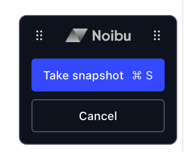
Click Take Snapshot, or use the keyboard shortcut (Cmd/Ctrl + S), to capture the snapshot.
Note: If the widget disappears when interacting with an element, use the keyboard shortcut to capture the snapshot. This is especially useful for hover states, where you need to hold your mouse over a menu item while taking the snapshot.
Note: You may need to ensure your browser or extensions are not blocking pop-ups, and that cookies are enabled.
Custom snapshots for mobile pages
When capturing a snapshot for a mobile web page, the snapshot window may not automatically open at a mobile viewport size. If this occurs, manually resize your browser window to approximate a standard mobile dimension (for example, 375 × 667 px) before taking the snapshot. This ensures the captured snapshot accurately reflects the mobile layout and element positions as rendered on users' devices.
Adjusting Cross-Origin-Opener-Policy (COOP) to enable custom snapshots
Some websites implement a restrictive Cross-Origin-Opener-Policy (COOP) header that prevents the Noibu toolbar from loading when a page is opened in a new browser tab. When this header is present, the new tab cannot retain the window.opener reference that the toolbar requires to communicate with the Noibu console, and the snapshot workflow cannot complete.
To check whether COOP is affecting your snapshot workflow:
Open the site in your browser.
Open DevTools → Network.
Reload the page.
Select the main document request.
In the Response Headers section, look for Cross-Origin-Opener-Policy.
Fix: To restore the opener relationship, remove or relax the COOP header. This preserves the window.opener reference, allowing the Noibu toolbar to load and function normally.
Analyzing heat maps for conversion insights
By analyzing individual pages that have recently launched or been updated, you can gather insights that inform UX decisions and drive optimization toward revenue outcomes. You can see not just where shoppers click, but which elements and pages are associated with purchases — at both the page level and the individual element level. With conversion metrics available, heat map analysis operates across two levels:
Page-level insight — decide which pages to prioritize:
A page with high traffic and a low checkout conversion rate may have a friction point, UX gap, or technical issue suppressing purchase completion. A page with lower traffic but a strong conversion rate may reward investment in driving more traffic to it. The page-level metrics ribbon surfaces these signals upfront, before you investigate individual elements.
Where page groups are configured, you can also compare an individual page's conversion rate against the group average to understand whether it is over- or underperforming relative to similar pages. For example, a product detail page with a 1.2% conversion rate may look acceptable in isolation, but if the product page group averages 3.5%, it signals that this specific page warrants closer investigation.
Element-level insight — identify what specifically to change:
An element with a high click rate but a low checkout conversion rate attracts attention without motivating purchase — it may benefit from repositioning, revised copy, or further investigation in session replays. An element with a low click rate but high revenue per session may be underplaced or under-promoted on the page.
Example questions heat maps can help answer:
Are shoppers scrolling far enough to see important content?
Example: The "Find My Store" button is among the most clicked elements on a product detail page, but it is located low on the page. Moving it higher may improve accessibility and drive faster customer decision-making.
Are users engaging with key elements placed in highly visible locations?
Example: A "Collections" link occupies prime space in the main navigation but receives very few clicks. Users may not expect to find it there. Consider relocating the link to reduce clutter and focus attention on higher-value actions.
Is a popular element pulling shoppers away from the buying path?
Example: A "Latest Styles Guide" editorial link on a product detail page has a high click rate, but a checkout conversion rate well below the page average. The element may be drawing shoppers away from completing a transaction. Consider relocating this content to a less prominent position.
Are campaign landing pages driving the right actions?
Example: Users land on a marketing campaign page but frequently click the top navigation, moving away from the page instead of converting on the intended call to action. Consider simplifying or hiding the main site navigation on marketing landing pages to keep users focused on the conversion goal.
Are landing pages retaining shoppers, or losing them immediately?
Example: A campaign landing page shows a high bounce rate in the page-level metrics ribbon, meaning most shoppers who arrive leave without any further interaction. Cross-referencing with the click map shows very few interactions below the fold, suggesting the page content is not compelling enough to encourage engagement.
Is a high-click element actually contributing to revenue?
Example: A homepage hero banner receives strong click volume, but switching the heatmap to the checkout conversion rate view reveals a conversion rate under 1%. A product grid below the fold shows a much higher rate despite fewer clicks. This may indicate the banner is driving exploratory behaviour rather than purchase intent.
Opening two browser tabs with different date ranges — for example, before and after a conversion drop — allows you to compare click distribution, scroll depth, and conversion metrics across time periods. This kind of comparison can help diagnose changes in customer behaviour related to feature releases, marketing launches, or UX updates.