Issues and Performance in Page Analysis
Last updated: March 18, 2026
Page Analysis provides multiple layers of insight into how each page performs, combining behavioural data with technical diagnostics. While Heat Maps and Journeys help you understand how users interact and navigate, the Issues and Performance tabs reveal underlying technical and performance factors that may affect conversions.
Issues Tab
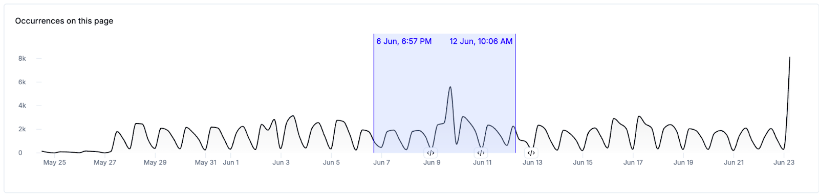
The Issues tab provides a view of technical errors over time specific to the selected page, which can be particularly helpful when investigating user-reported issues tied to specific page URLs.
After choosing a page for analysis, a time-series chart illustrates error occurrences by day, allowing users to identify trends or sudden spikes in issue volume. If enabled, release events will be indicated along the horizontal axis of this chart via a icon. Clicking the icon will show you a preview of release events that occurred on that date, allowing you to investigate further.

Clicking and dragging on this chart allows you to narrow down the data to a custom date range
Below the chart is a detailed list of issues affecting the selected URL, segmented by:
- Priority Issues: issues categorized by Noibu as Priority Issues
- Spiking Issues: important issues with a >20% spike in occurrences compared to the previous time period
- Frequent Issues: all issues affecting the page, sorted by Conversion Impact and frequency of occurrence
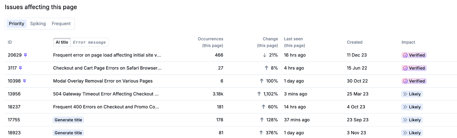
Clicking on any issue in this table will open its corresponding Issue Details in a new tab – including impacted sessions, error metadata, and stack traces.
Performance Tab
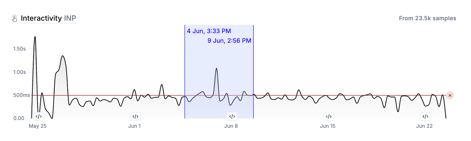
The Performance tab shows Core Web Vitals—Loading Speed (LCP), Interactivity (INP), and Visual Stability (CLS)—for the selected page:
- Loading Speed (LCP): measures the load time of the largest visible content element on the page.
- Interactivity (INP): tracks how quickly the page responds to user interactions.
- Visual Stability (CLS): captures how stable the layout is during load.
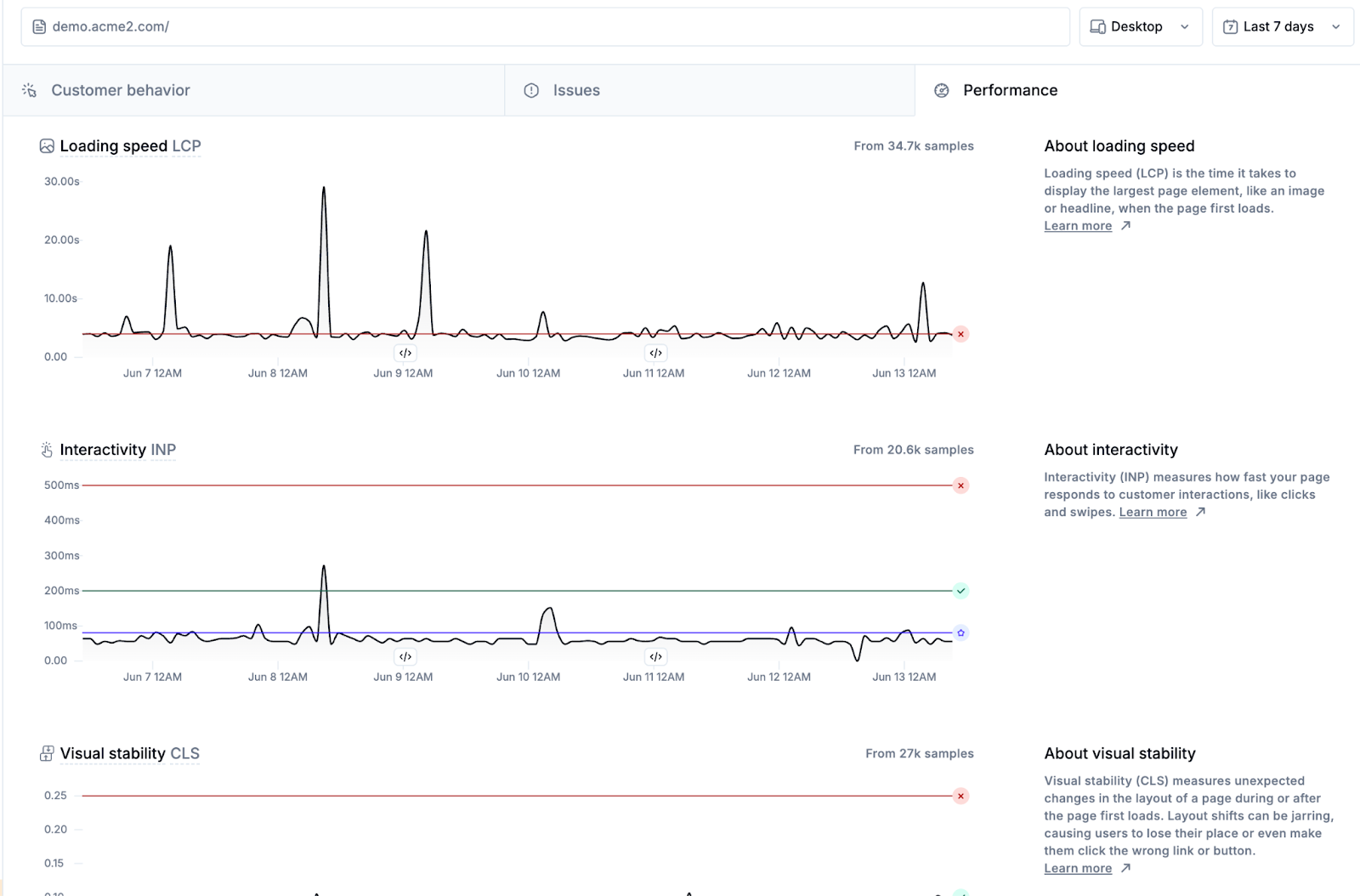
Each metric is displayed in an individual time-series chart for the selected time period, compared against Google’s and Noibu’s benchmarks. Learn more about performance monitoring metrics.
If enabled, release events will be indicated along the horizontal axis of this chart via a icon. Clicking the icon will show you a preview of release events that occurred on that date, allowing you to investigate further.
Clicking and dragging on any chart allows you to narrow down the data to a custom date range.